List pages
Overview
List pages are used to render a mobile extension as a list with an infinite number of child components.
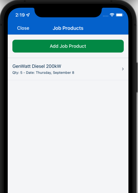
List pages are defined in the ui_def.json file as type: "list", as shown in the following example from the Job Products extension:
{
  "firstPage": "JobProductListPage",
  "pages": {
    "JobProductListPage": {
      "title": "form.JobProductListPages.JobProductTitle",
      "type": "list",
      ...
    }
  },
}
List page definition
The list page definition extends the AbstractPageComponent definition and includes the following properties:
| Property | Description |
|---|---|
sourceExpression |
The data expression used used as the extension data source. |
headerTitle |
The header title of the list (distinct from the page title). Localized string |
headerDescription |
The description of the list, which is displayed below the header title. Localized string |
emptyText |
Shown when there is no item in the list. A Localized expression string. |
itemLayout |
ListPageViewComponent. Used to decide which template to render. |
itemClickDestination |
When the user clicks on a row, navigate them to another page → RoutingType Guideline |
addNew |
Add a new object definition. Define if the user wants to have an Add button on the screen. If undefined, no Add button will be rendered. |
addNew.text |
The text of the Add button. A Localized expression string. |
addNew.destinationPage |
When the user taps the Create new button, navigate them to another page → RoutingType Guideline |
addNew.defaultData |
The default data when a new object is created and passed to the next page. |
addNew.showIfExpression |
Determines if the Add button is shown or not. |
hasSection |
If the list has a section or not. This introduces the new data context when used inside sectionTitleProperty and sectionTitleText, which is a sectionItem. |
hasSection.sectionTitleProperty |
The title “property” that the section should be grouped to. |
hasSection.sectionTitleText |
The text localized key that is used to display the section title. |
orderBy |
Used to order the data before displaying. |
orderBy.expression |
Special expression to define the ordering logic. |
search |
Allow the user to filter data from the itemSource. |
The following is an example of a list page definition for the job products extension:
"JobProductListPage": {
      "title": "form.JobProductListPages.JobProductTitle",
      "type": "list",
      "addNew": {
        "text": "form.JobProductListPages.Add",
        "destinationPage": "UpsertJobProductPage",
        "defaultData": {
          "data": {
            "JobId": "${metadata.contextObjectId}"
          },
          "objectName": "JobProducts"
        }
      },
      "sourceExpression": "formData.JobProducts",
      "emptyText": "form.JobProductListPages.Empty",
      "search": {
        "placeholder": "form.JobProductListPages.SearchPlaceholder",
        "filterOnProperties": ["Product.Name", "Product.Description"]
      },
      "itemLayout": {
        "type": "titleAndCaption",
        "title": "form.JobProductListPages.ItemTitle",
        "caption": "form.JobProductListPages.ItemCaption"
      },
      "itemClickDestination": "UpsertJobProductPage"
    },
Header title and description
The headerTitle and headerDescription properties are used to define the header title and description of the list page. They are placed at the top of the list and can be scrollable. The header title is distinct from the page title.
The following is an example of the header title and description:
"headerTitle": "form.JobProductListPages.headerTitle",
"headerDescription": "form.JobProductListPages.headerDescription",
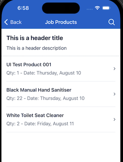
If there is only a single button, either the addNew button or another button group, button group will be rendered on the right side of the header.
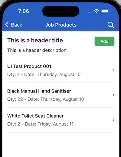
Add a new process
In the provided example above, the addNew property is defined as follows:
"addNew": {
        "text": "form.JobProductListPages.Add",
        "destinationPage": "UpsertJobProductPage",
        "defaultData": {
            "data": {
                "JobId": "${metadata.contextObjectId}"
            },
            "objectName": "JobProducts"
        }
    },
showIfExpression for addNew objects
In some cases you may want to hide the Add button to prevent further user edits on an object. For example, we do not want users to add more items or make edits to an object with status == 'Approved'.
To do this, define the showIfExpression property in the following way:
"showIfExpression": "pageData.Status != 'Approved'"
This removes the Add button from the list page when the Status of the pageData is Approved.
Navigate to a child page
This List Page Component enables users to navigate to another screen by tapping on a child row. This is achieved by defining the itemClickDestination.
When a user taps on a row, the system will navigate to the destination page and pass the data context of the row to the destination page. The mobile extension engine clones the item and refers to it as pageData.
The following is an example of the data context of a child item:
{
  "item": {
    "__typename": "JobProducts",
    "UID": "xxx",
    // ...other properties
  },
  // ...other context data
}
This data is then cloned and passed to the destination page as pageData. The following is an example of the data context of the destination page:
{
  "pageData": {
    "__typename": "JobProducts",
    "UID": "xxx",
    ...
  }
}
hasSection definition
This property groups all items by corresponding sections.
For example, the following form uses hasSection to group onsite plants for a client by the floor they are on:
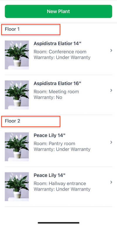
The data for this list is defined in the instanceFetch.json file as follows:
{
  "type": "GraphQl",
  "Assets": {
    "object": "Asset",
    "fields": [
      "UID",
      "Name",
      "AccountId",
      "AssetType",
      "InstallDate",
      "Description",
      "Notes",
      "Floor",
      "Room",
      "UnderWarranty",
      "OnsiteLocation"
    ],
    "filter": "AccountId == '${accountId}'",
    "variables": {
      "accountId": "$it.AccountId"
    }
  ,
  ...
  }
The hasSection property is defined in the ui_def.json file, and uses the sectionTitleProperty and sectionTitleText properties to display the data as sections:
"hasSection": {
  "sectionTitleProperty": "Floor",
  "sectionTitleText": "AssetListPage.SectionTitle"
},
Section Title Localization and DataContext
Based on the provided configuration, the mobile extension engine will group all rows that have the same Floor value and display them as a section. The sectionTitleText is a localized string that is used to display the appropriate text for the section title.
In the localization file, the AssetListPage.SectionTitle is defined as follows:
"SectionTitle": "${sectionItem.title}"
This introduces the new sectionItem data context, which is structured as follows:
// sectionItem
{
  title: "string" // Grouped property value based on the sectionTitleProperty
}
The title property value is derived from the Floor of each item, as specified in the sectionTitleProperty. In advanced scenarios, custom functions or expressions can be used to dynamically render titles based on values.
Note
You cannot use the item data context when rendering the section title. This behavior is inherent because a section is grouped by multiple items, making it impossible for the system to discern which item context to access.orderBy definition
The orderBy definition sorts the data source before displaying it. It is defined as follows:
"orderBy": {
  "expression": ["Floor asc", "Name asc"]
  },
In the provided example, the list displays the data in the following order:
FloorascendingNameascending
The first property is the data to display, the keywords asc|desc are used to define the order in which to display the data.
Search definition
The search definition allows users to filter the data source on the mobile extension list page.
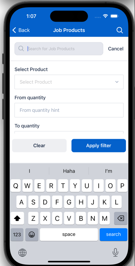
Basic search implementation
Basic search renders a search icon on the top right of the list page. When the user taps on the search icon, the system will render a search bar on the top of the list page. The user can then type in the search bar to filter the data source.
To define basic search, the list page requires the following configuration:
"search": {
  "placeholder": "form.JobProductListPages.SearchPlaceholder",
  "filterOnProperties": ["Product.Name", "Product.Description"],
}
| Property | Description |
|---|---|
placeholder |
The placeholder text for the search bar. A Localized expression string. |
filterOnProperties |
The property name of each item to filter on. |
Advanced search implementation
Advanced search allows developers to include more controls and create more complex queries using lists.
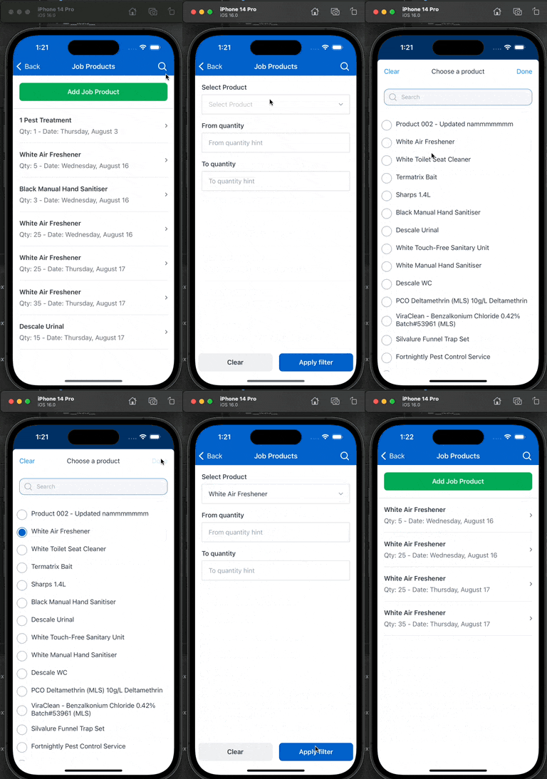
The following is an example of an advanced search implementation:
"search": {
  "advancedFilter": {
    "ui": {
      "items": [
        {
          "type": "selectEditor",
          "title": "form.ShowCasePage.SelectProduct",
          "structureExpression": "filter.Product",
          "valueExpression": "filter.ProductId",
          "sourceExpression": "sharedData.Products",
          "displayExpression": "filter.Product.Name",
          "placeholder": "form.ShowCasePage.SelectProductHint",
          "selectPage": {
            "itemTitle": "form.ShowCasePage.SelectProductItemTitle",
            "emptyText": "form.ShowCasePage.SelectProductEmpty",
            "title": "form.ShowCasePage.SelectProductTitle",
            "searchBar": {
              "filterOnProperties": ["Name"]
            }
          }
        },
        {
          "type": "textEditor",
          "keyboardType": "number-pad",
          "valueExpression": "filter.StartQty",
          "title": "form.JobProductListPages.StartQuantity",
          "placeholder": "form.JobProductListPages.StartQuantityHint"
        },
        {
          "type": "textEditor",
          "keyboardType": "number-pad",
          "valueExpression": "filter.EndQty",
          "title": "form.JobProductListPages.EndQuantity",
          "placeholder": "form.JobProductListPages.EndQuantityHint"
        }
      ]
    },
    "expression": "cf.useAdvancedFilter(filter,item)"
  }
},
| Property | Description |
|---|---|
advancedFilter.ui |
The advanced filter UI definition. |
advancedFilter.ui.items |
The list of items to render that are inherited from Flat page components. |
advancedFilter.expression |
An expression designed to evaluate and return a true/false value for each item sourced in the advanced search filter bar. It allows you to define custom logic, including the use of custom functions, to determine the inclusion of items based on specified criteria during advanced filtering.
|
advancedFilter.defaultData |
The default data object to use in default values for the filter data context. |
advancedFilter.events |
The events to trigger when the advanced filter is applied. |
advancedFilter.events.afterFilterSubmit |
The event to trigger after the advanced filter is submitted. The mobile extension builder obtains values from the filter context to perform another action. |
Filter data context
The filter data context is a key element introduced by the advanced search feature. It serves as a designated space to store values crucial for the functionality of the advancedFilter.
When developing components tailored for the advancedFilter, the filter context becomes integral for binding data and executing expressions.
The filter data context finds its application within specific properties, notably:
advancedFilter.ui.itemsadvancedFilter.expression
Extending its functionality, the filter data context proves versatile across the entire ListPage. For example, it can be utilized to access advancedFilter data for routing purposes.
Combining basic and advanced search
You can combine both type of search. The final result will appear as follows:
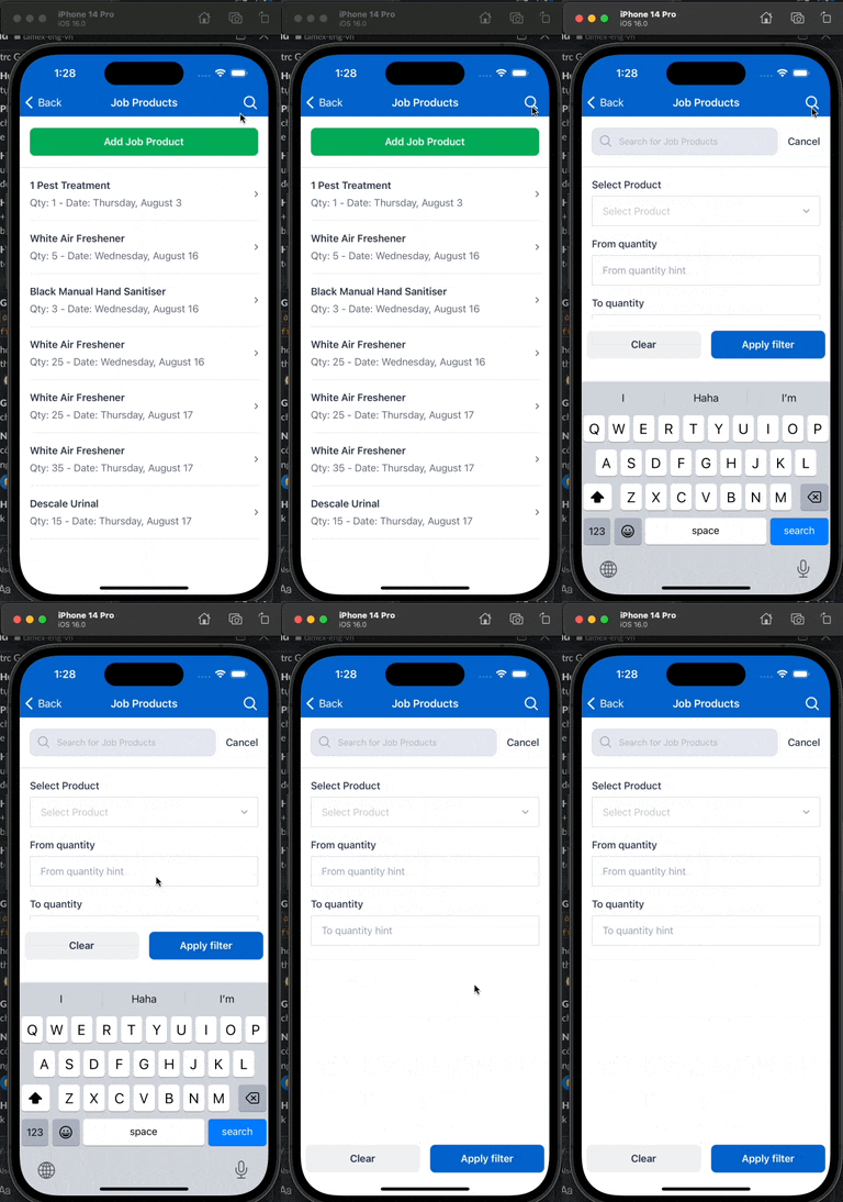
When both basic and advanced search are used, an item from the data source must pass filters for both basic and advanced search to be included in the final result.
Button group definition
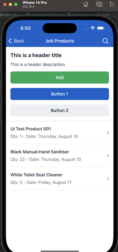
The buttonGroup property is used to render a group of buttons other than the Add new button.
These buttons are rendered in the header of the list below the header title and header description.
ButtonGroup properties
| Property | Description |
|---|---|
items |
ButtonGroupItem[]The list of buttons to render. |
ButtonGroupItem properties
| Property | Description |
|---|---|
text |
The text of the button. A Localized expression string. |
theme |
The theme of the button. One of "success", "primary", "default". |
behavior |
The same behavior as the ButtonGroupFlatPage. |
disabled |
A data expression that returns a boolean value to determine if the button is disabled. |
Example configuration
The following is an example of a button group configuration:
"buttonGroup": {
  "items": [
    {
      "text": "form.JobProductListPages.ButtonGroup1",
      "theme": "primary",
      "behavior": {
        "type": "custom",
        "functionExpression": "cf.alert('Alert from button 1')"
      }
    },
    {
      "text": "form.JobProductListPages.ButtonGroup2",
      "theme": "default",
      "behavior": {
        "type": "custom",
        "functionExpression": "cf.alert('Alert from button 2')"
      }
    }
  ]
}
The above configuration renders the following button group:
CRUD operations
Buttons can also be used to perform CRUD(create, read, update, delete) operations on the dataContext using a custom function.
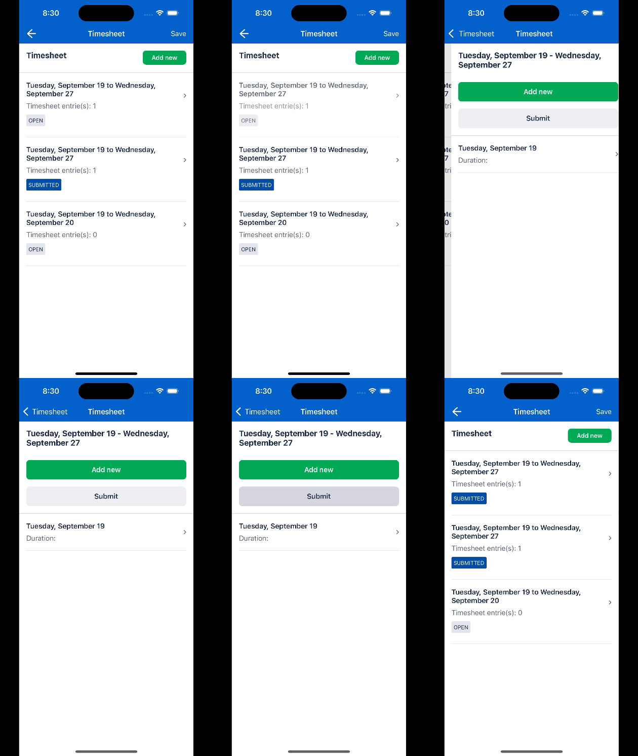
For example, the following changes the selected timesheet record status to Submitted:
ui_def.json
"buttonGroup": {
  "items": [
    {
      "text": "form.TimeSheetEntriesPage.Submit",
      "theme": "default",
      "behavior": {
        "type": "custom",
        "functionExpression": "cf.setStatusSubmitted(pageData)"
      }
    }
  ]
}
customFunctions.ts
function setStatusSubmitted(pageData:any, {extHelpers}: Extras) {
  extHelpers.data.changeData(() => {
    pageData.Status = 'Submitted'
    extHelpers.data.submit({ stopWhenInvalid: true })
        .then(result => {
          if (result) return;
          pageData.Status = 'Open'
        })
  })
}
The following shows the result of the above configuration:
Feedback
Was this page helpful?